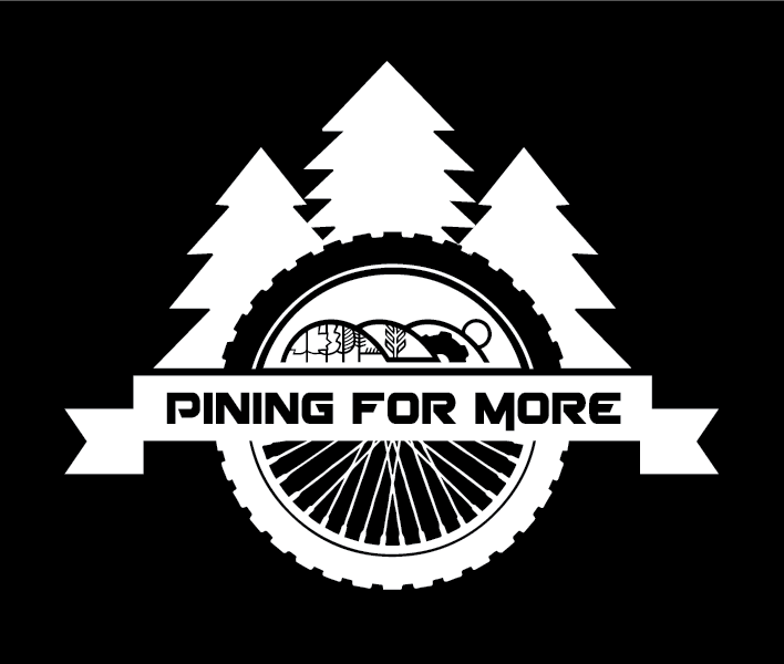
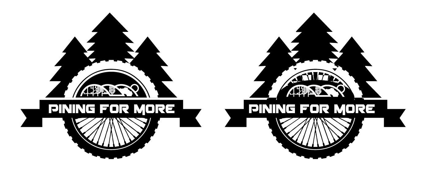
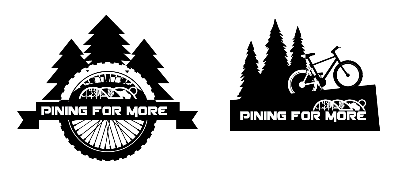
Design a single color team logo for a cycling event that included treacherous forest terrain, the team name, and featured the city of Caledon logo.
MY ROLE:
I started off by finding some cycling components I could work with, making them into vectors and simplifying them for use in a logo. Then I followed a similar process with the City of Caledon logo (but without making any visual modifications). After doing some research on the event, pine trees seemed an obvious choice to represent the forested terrain. Finally, a strong, sporty font was chosen for the team name and I was off to the races! The challenging bit was finding a way to make all of these components work together. Ultimately I settled on the wheel design which afforded several large and clean shapes that would be easily recognizable and screen printed without losing detail.