Create a new, higher end look for the Aqualitz brand moving packaging away from rectangular boxes and into something more eye catching and exciting. Artwork should be able to have variations that will define different categories within the product line.
MY ROLE:
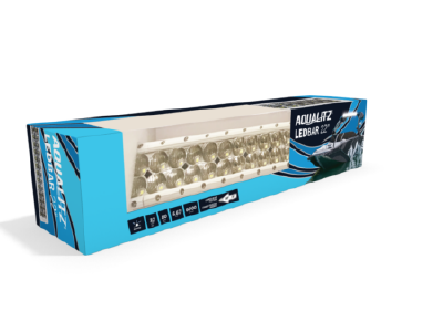
Create artwork that is bright and will contrast well with a line of predominantly white products. The blue wave design is indicative of water and helps the previous branding look more modern and luxurious when paired with the dark background.
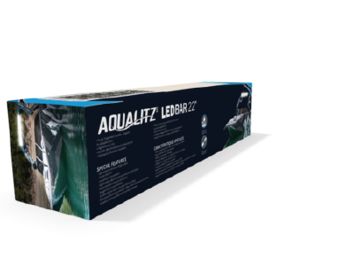
Full panel lifestyle images help make the product use clear without cluttering up the packaging. I've tried to keep each of the panels clean and clear, with only the appropriate and essential information needed for each panel displayed.
The shades of blues can easily be swapped for sea foam greens, or sunset purples to differentiate the different categories throughout the product line.